
Wodka Gorbatschow
Klarer Cut für eine Ikone
Seit 1921 wird Wodka Gorbatschow in Berlin produziert – heute ist die Marke Deutschlands Nummer eins im Spirituosenmarkt. Nach über 100 Jahren Erfolgsgeschichte war der Moment gekommen, die Ikone neu zu denken: weg von angestaubten Zwiebeltürmchen, hin zu einem Auftritt, der die Klarheit und Modernität der Marke selbstbewusst sichtbar macht.
Kund:in
Jahr
2023
Leistung
Brand Building
Redesign
Packaging Design
Credits
Concept/Agency – Flächenbrand


Process
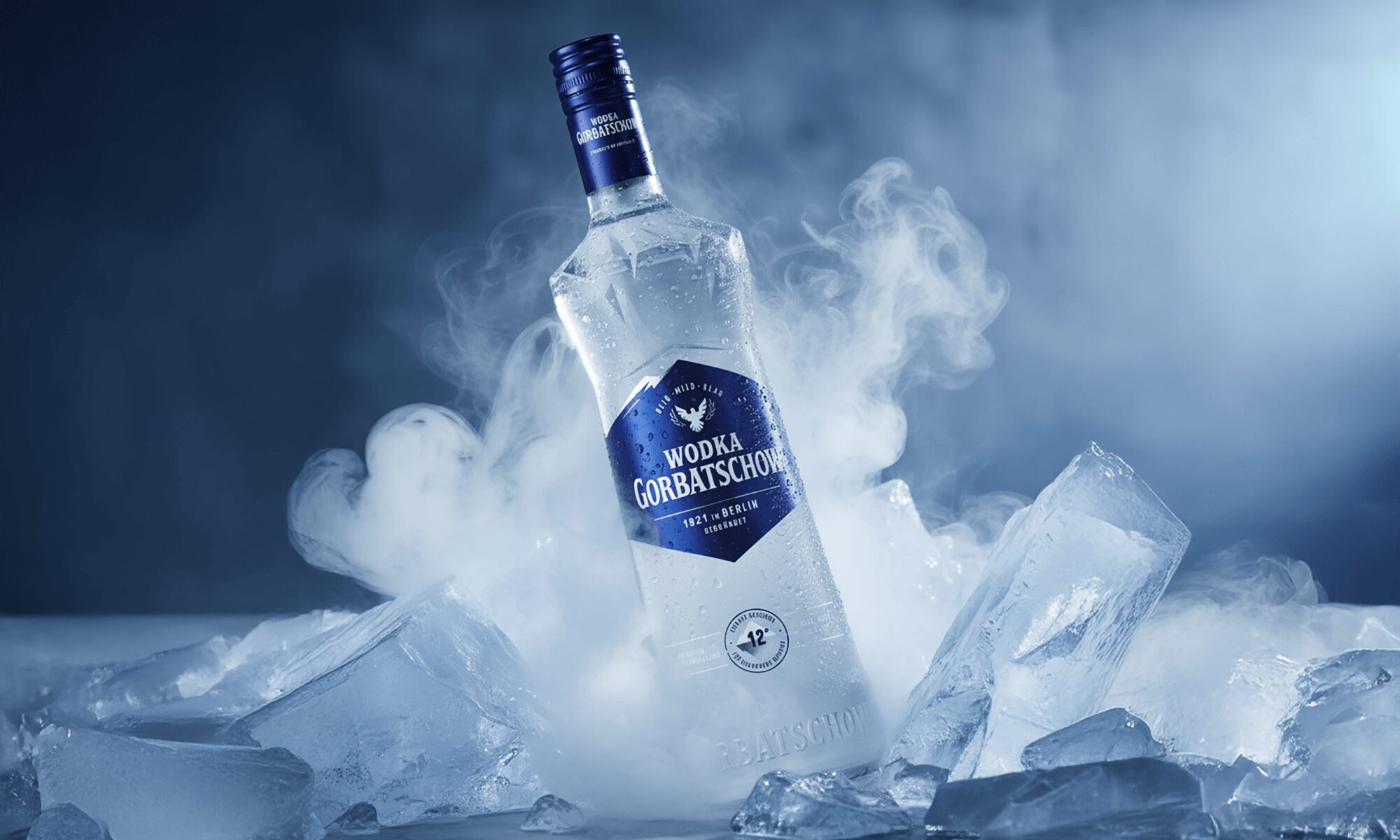
Ausgehend von der charakteristischen Eisfiltration und dem Versprechen „eiskalt, glasklar“ entwickelte Flaechenbrand Wiesbaden das neue Markenkonzept und die überarbeitete Flaschenform. Für die visuelle Umsetzung und die Übersetzung ins Packaging Design vertraute die Agentur auf Okka Studio.
Das Redesign nimmt die bekannte Silhouette auf, bricht sie jedoch mit klaren Facetten und scharfen Kanten auf – als visuelles Symbol für Reinheit und Präzision. Gleichzeitig wurden auch die Premix-Getränke neu gestaltet: mit einem vereinheitlichten Design und einem dominanten Logo, das den Trend zu boldem Branding aufgreift und maximale Präsenz am Regal erzeugt.


Die Kombination aus reduzierter Gestaltung, klarer Typografie und ikonischer Flaschenform positioniert Wodka Gorbatschow als Marke mit Strahlkraft – ein Statement in Blau, das Modernität und Beständigkeit gleichermaßen verkörpert.

Result
Das neue Erscheinungsbild von Wodka Gorbatschow vereint Tradition und Zeitgeist. Die ikonische Flasche tritt selbstbewusst auf, mit einer Klarheit, die das Produktversprechen unmittelbar sichtbar macht. Die übergroße Markeninschrift verleiht den Premixes maximale Strahlkraft, während die Bildwelt die markentypische Verbindung zu Eis und Kälte neu interpretiert.


Okka Studio
Contact
hello@okka-studio.com
+49 (0) 151 175 577 00
@okka__studio
